Primevideo.com
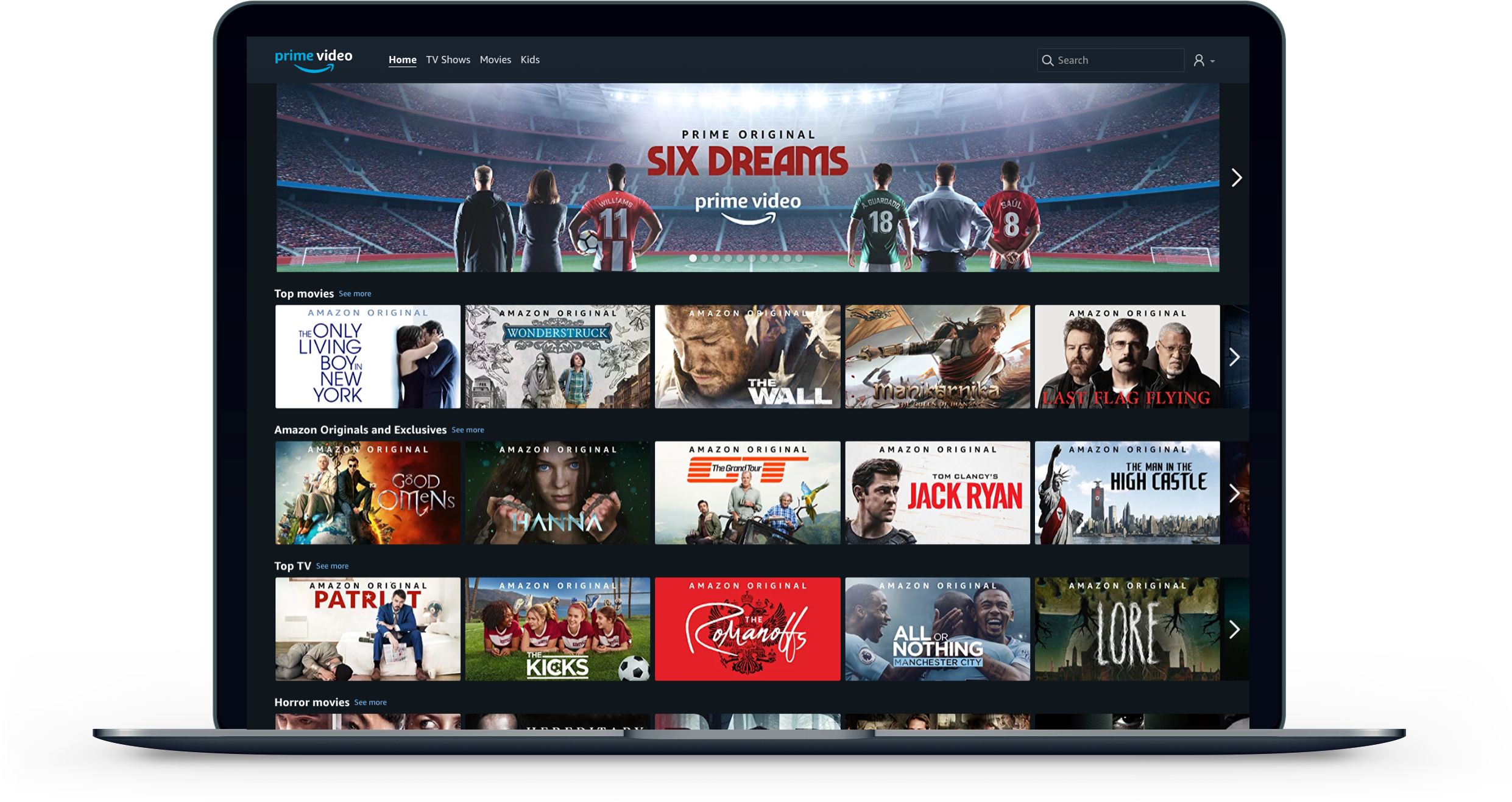
Role: Lead Designer
Launched: December 2016
I was the Lead Designer for the launch of PrimeVideo.com, a standalone fully responsive website run on a single codebase. I was the UX point of contact across Leadership, Senior Product Managers and global teams, responsible for the end-to-end design process from sketching and wireframing through to prototyping, user testing, visual polish and documentation.
The new website let customers in 200+ countries watch Amazon's original TV shows and movies, with content subtitled and dubbed in French, Italian, Portuguese and Spanish.
Discovery & Strategy
Early in the project there was an open question about whether to replace the existing Amazon Video site or build something new alongside it. We ran multiple rounds of user testing to explore concepts before committing. We tested a standalone dark-theme experience, a light theme variant, 1-click playback icons to indicate ownership, mixed vs. uniform packshot sizes, and immersive autoplay trailers. The business landed on a subscription-only standalone site in the dark theme, consistent with the existing mobile and TV app experiences.
User Journeys: Wireframes
I worked with multiple PM Leads and Lead Engineers to wireframe all the scenarios the site needed to handle. A lot of this centered on payment instruments and parental controls varying by country, and customers who travel.
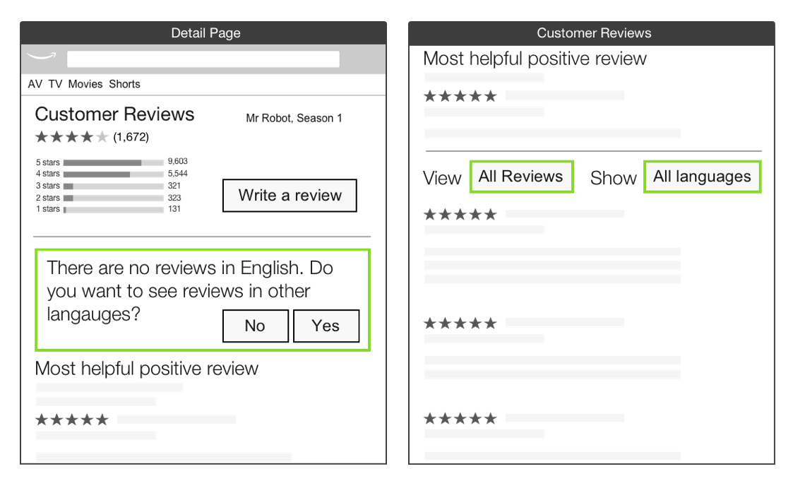
One specific problem I solved was around reviews: when launching a title in a new country that had no local reviews, I recommended surfacing all reviews and prioritizing the customer's language first. That way we could always show a rating, which customers use to decide what to watch.
Ideation: User Testing
Prime Video within Amazon.com storefront
Standalone Prime VIdeo storefront.
During the scoping phase of the project, the business was toying with the idea of replacing the existing Amazon Video website with a Standalone website, or keeping the existing site and adding a new standalone website. PrimeVideo.com was an opportunity to solve some long standing customer frustrations, so we conducted multiple rounds of User Testing to see how customers reacted to new concepts and visual treatments.
In the end, the business opted for a subscription only, standalone PrimeVideo.com website in the dark theme, this aligned us with our existing Mobile and TV App experiences.
At an external user testing lab we tested and validated various concepts and patterns, such as showing a 1-Click playback icon to indicate ownership, using a one size for all pack-shot size against a mixed portrait for movies and landscape for TV shows. We also tested a light theme against a dark them to see if customer reacted to and understood the color change. Immersive autoplaying video ad trailers were also tested.
Digital Video User Interface
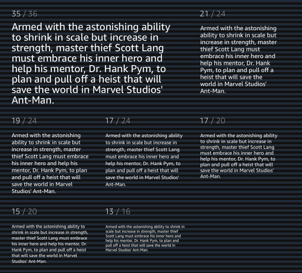
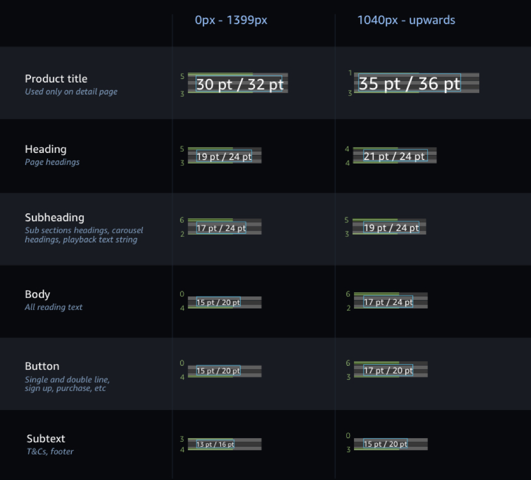
We introduced a new UX system for Amazon Video to give us a consistent, flexible foundation across a growing number of devices and markets. The storefront we launched was a reskin of the existing Amazon Video UI due to engineering constraints, but the detail page, search, browse and settings pages were all designed from scratch. The grid system was built around carousel and packshot dimensions to make sure content worked efficiently at every resolution.
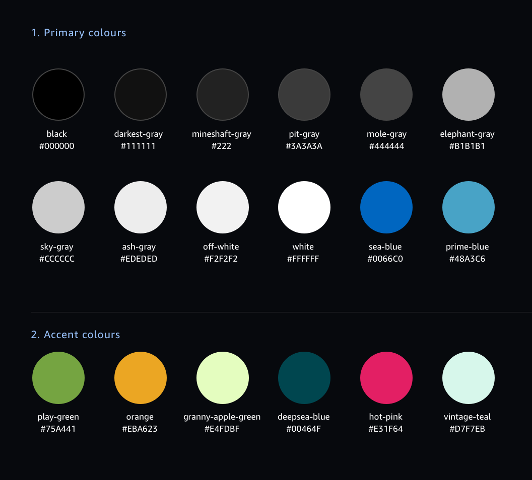
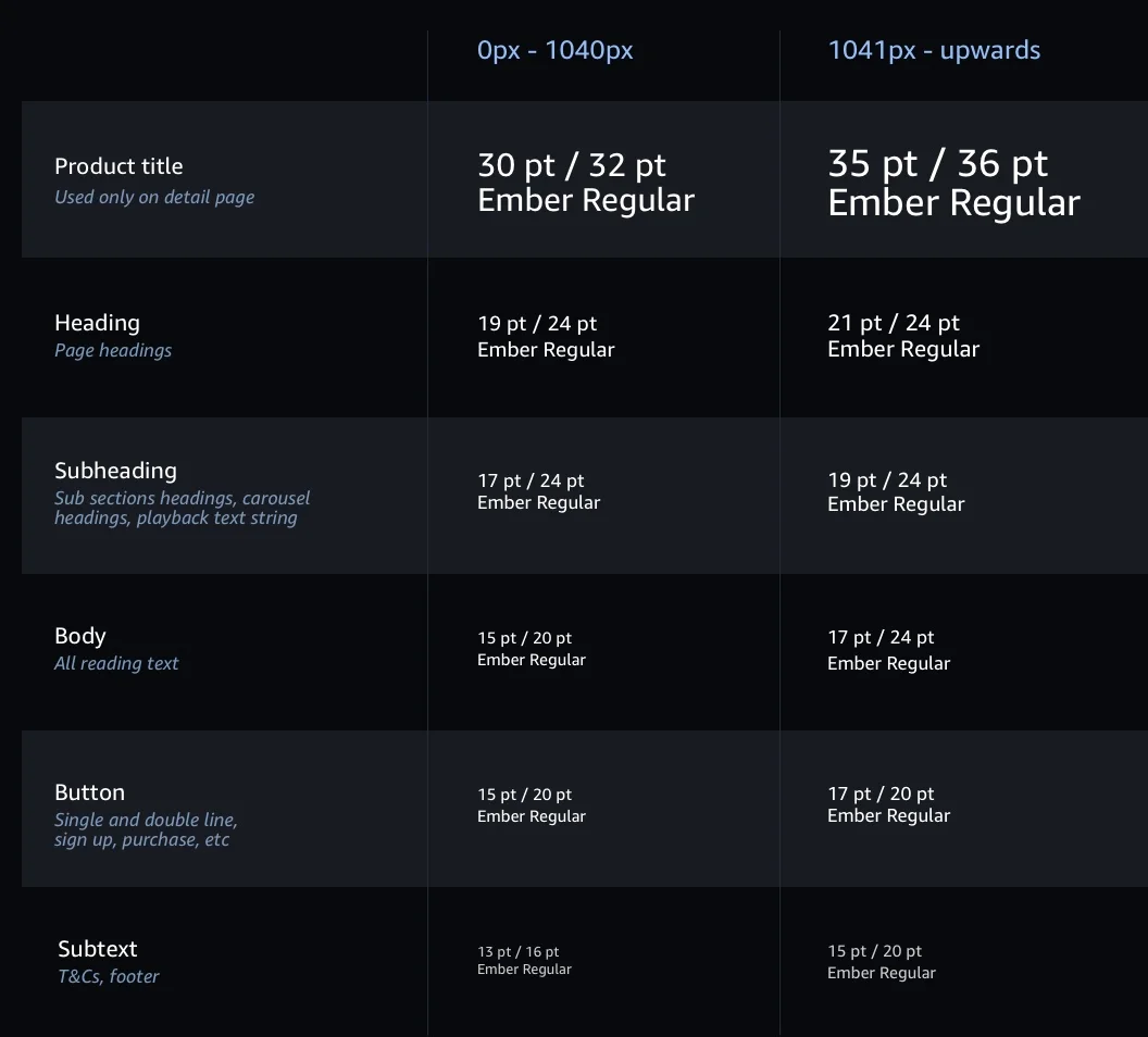
Grid System
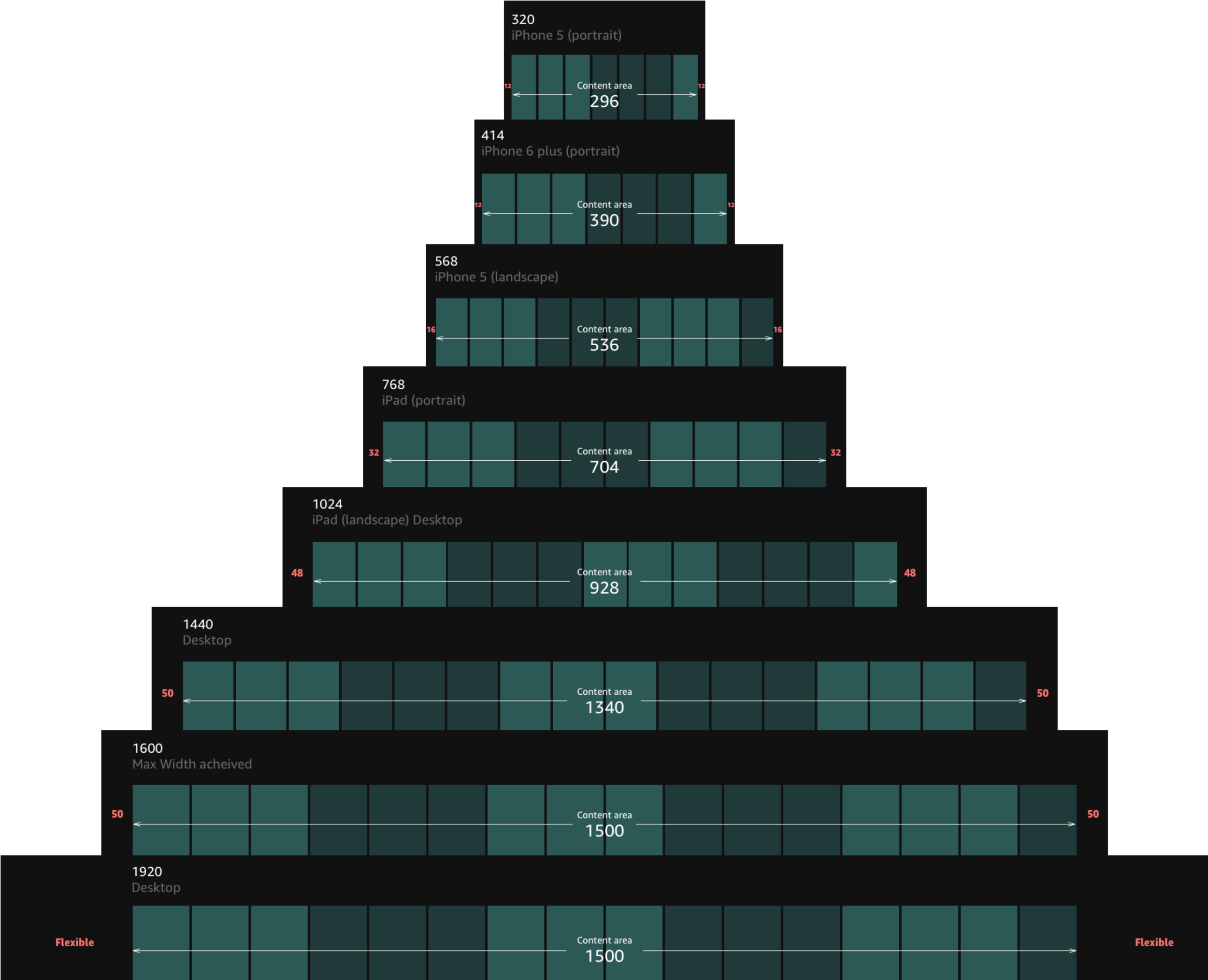
The grid for PrimeVideo.com is based on the starting point of the carousels and packshots within. The grid allows us to design and code in a way that ensures content utlitises all resolutions efficiently and maintains a cohesive look and feel across all devices.
Visual Design
Owing to engineering overheads, the storefront we launched with was a reskin of the existing Amazon Video storefront, all other pages such as the search, browse, detail page and settings pages were built from scratch. An adaptive storefront was launched, with a responsive storefront planned as a follow up.
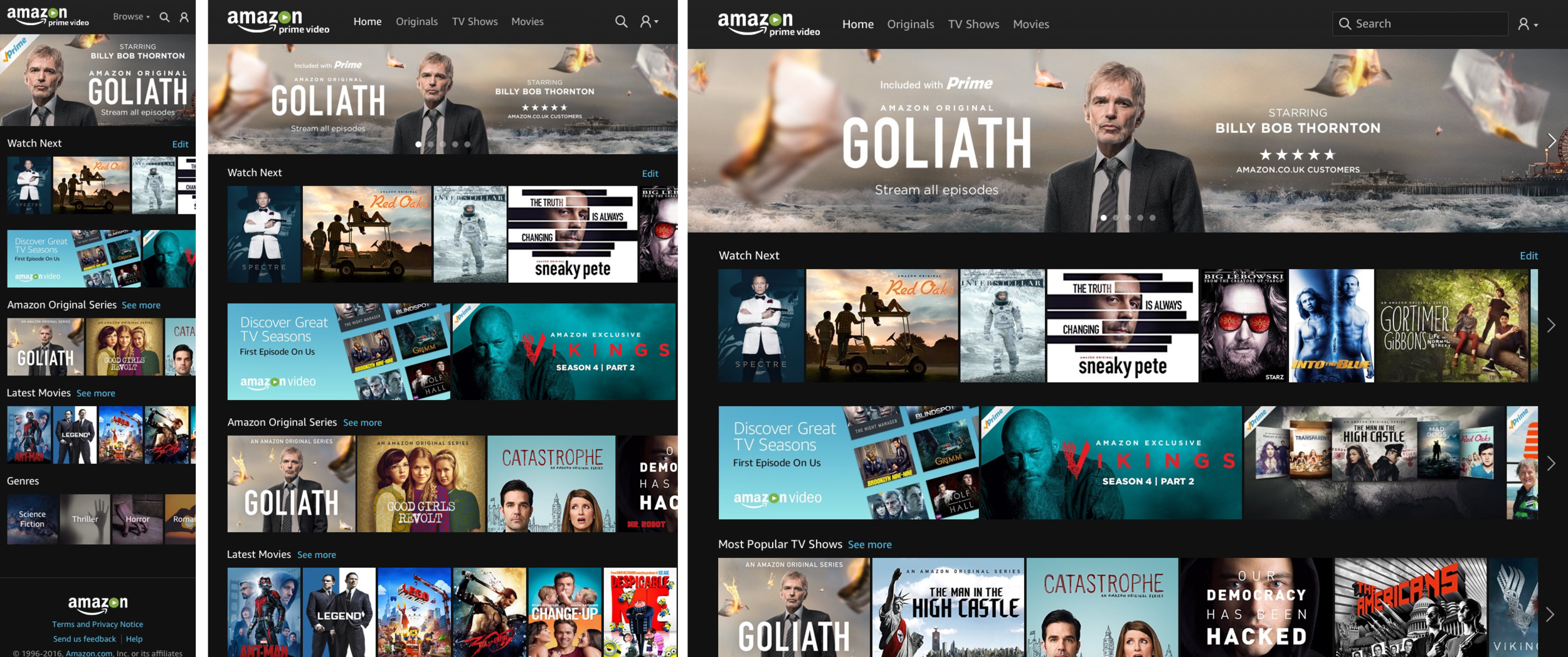
Responsive nav and homepage
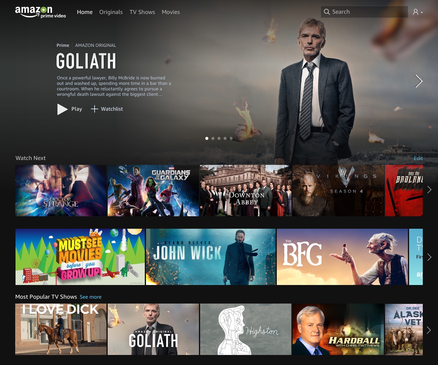
Intended design for the storefront with immersive hero ad and 16:9 video artwork.
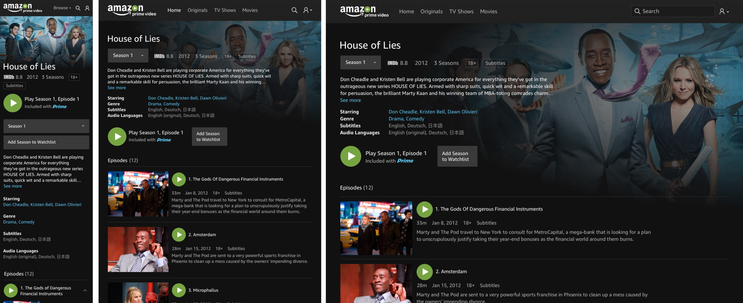
Brand new fully responsive detail page which took lead from the Fire TV UI.
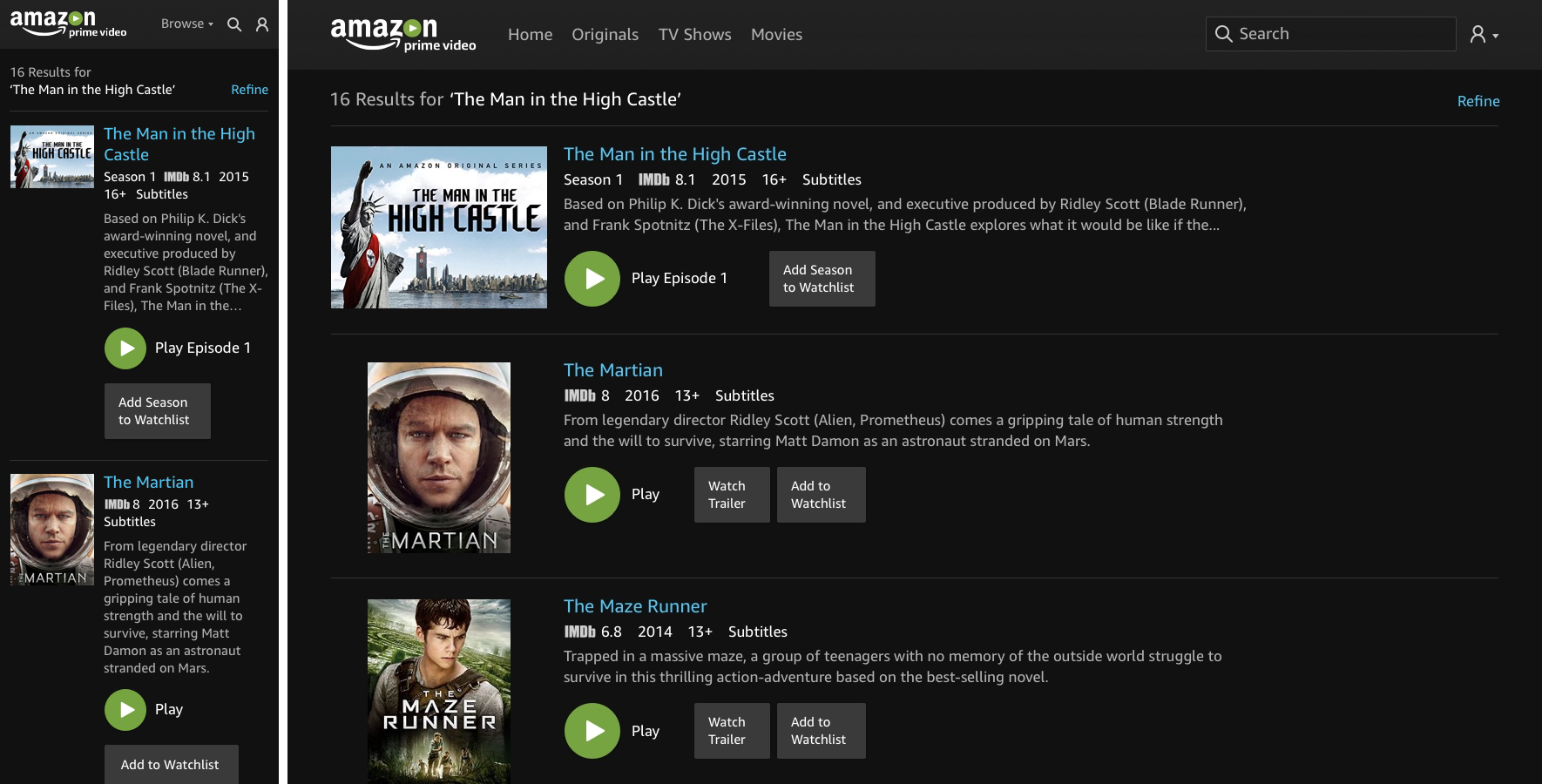
Fresh new design for search and browse pages, we surface the data the customer needs, and allow them to start playback from there - reducing the need to travel to the detail page.
Delivery
Beyond designing the new experience, I was responsible for the quality of the delivery and was the owner of the UX SIM/Ticket process which involved writing and assigning tasks to designers, engineers and product teams.
I created SIM templates which ensured SIMS raised by designers & engineers were written correctly and assigned to the correct teams. I worked with engineering and PM’s prioritize SIM’s - recognize which were customer defects that had to be fixed and which could wait until post launch.
Ongoing, launch bugs are still being balanced against the build of new features and de-scoped features. There were 243 bugs initially, this has been brought down to 46. Launch bugs are still being balanced against the build of new features.